After the merger of United Airlines and Continental Airlines a new master brand was rolled out by Lipponcott, a New York City agency specializing in brands. Two years after the merger, United Airline’s business to business sister entity, United Cargo, approached me about developing a sub-brand for the Cargo product under the United brand.
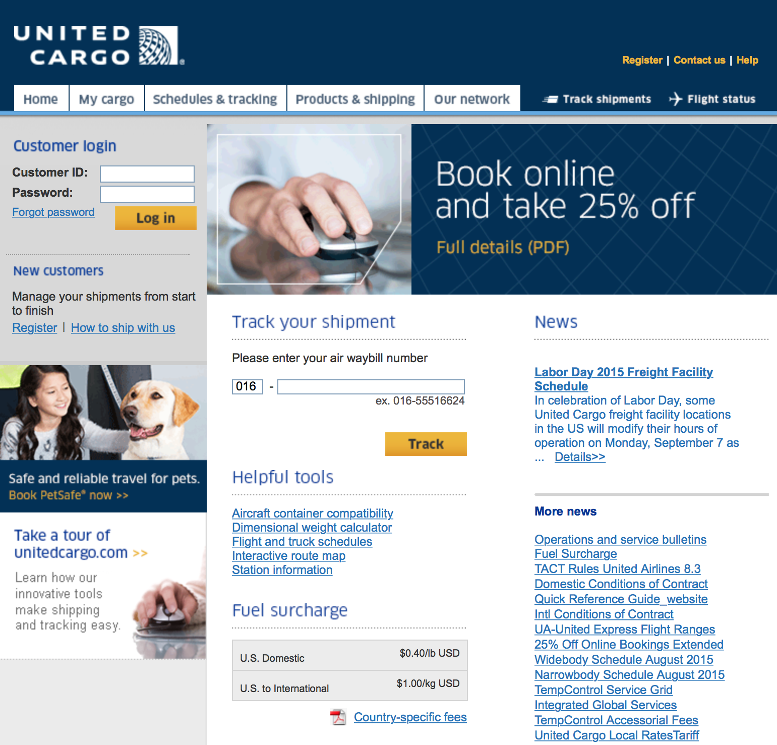
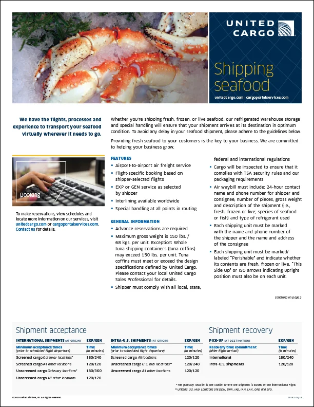
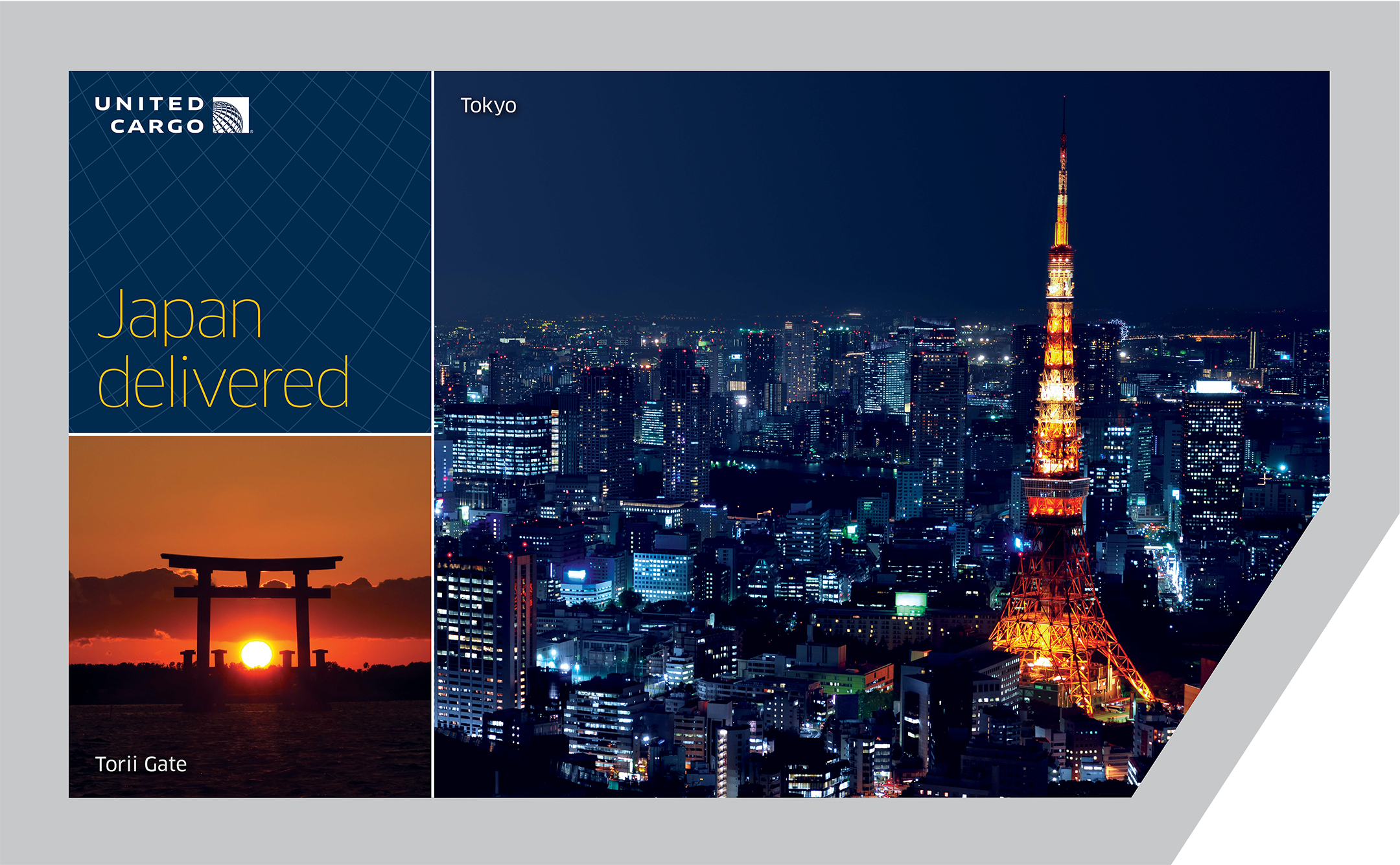
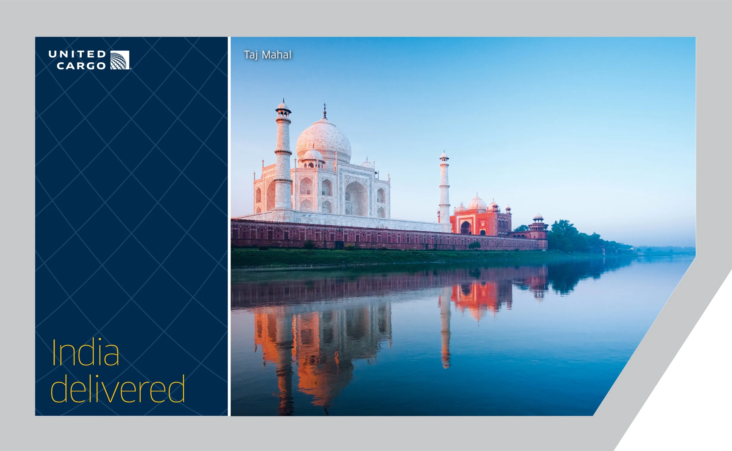
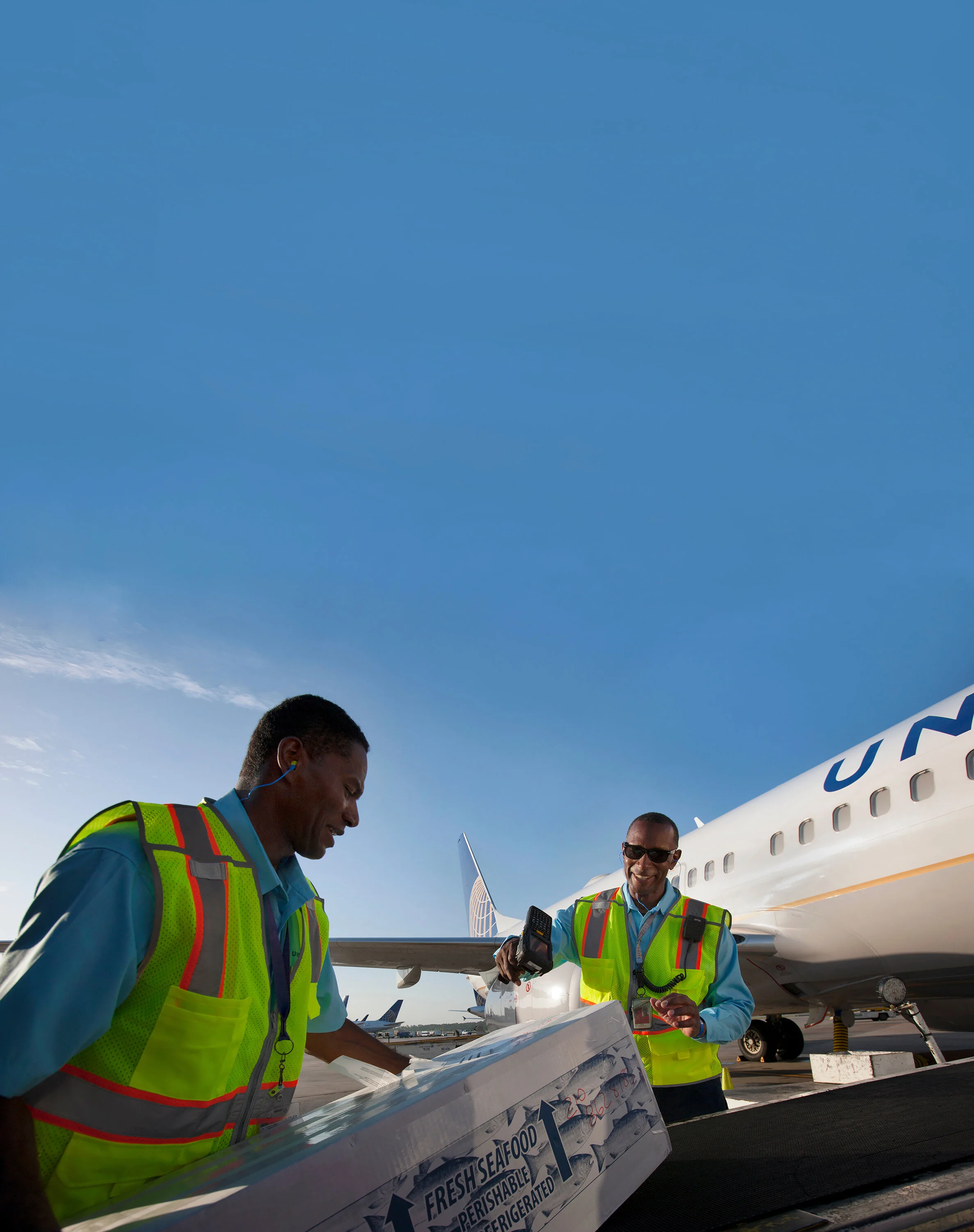
The intention was to be more thoughtful to their audiences and products. United Cargo specializes in global shipping for a range of products: produce, flowers, mail, temperature control pharmaceuticals (TempControl), animals (PetSafe), etc. The primary audience for United Cargo are shippers working with small businesses to deliver their products all over the world. The field is male dominant and knowledgeable on aircraft shipping.
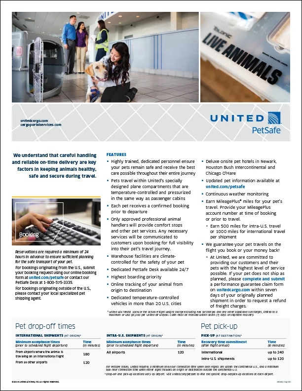
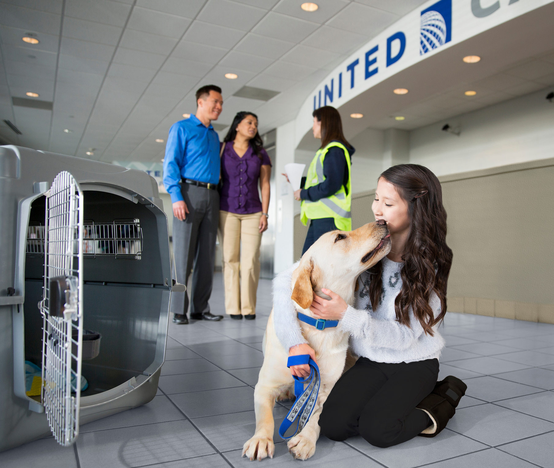
In addition to a business to business audience Cargo also oversees the United PetSafe product. This process creates a bridge to the United customer audience, therefore the United Cargo brand also had to tie back to the master characteristics of safe, friendly travel.
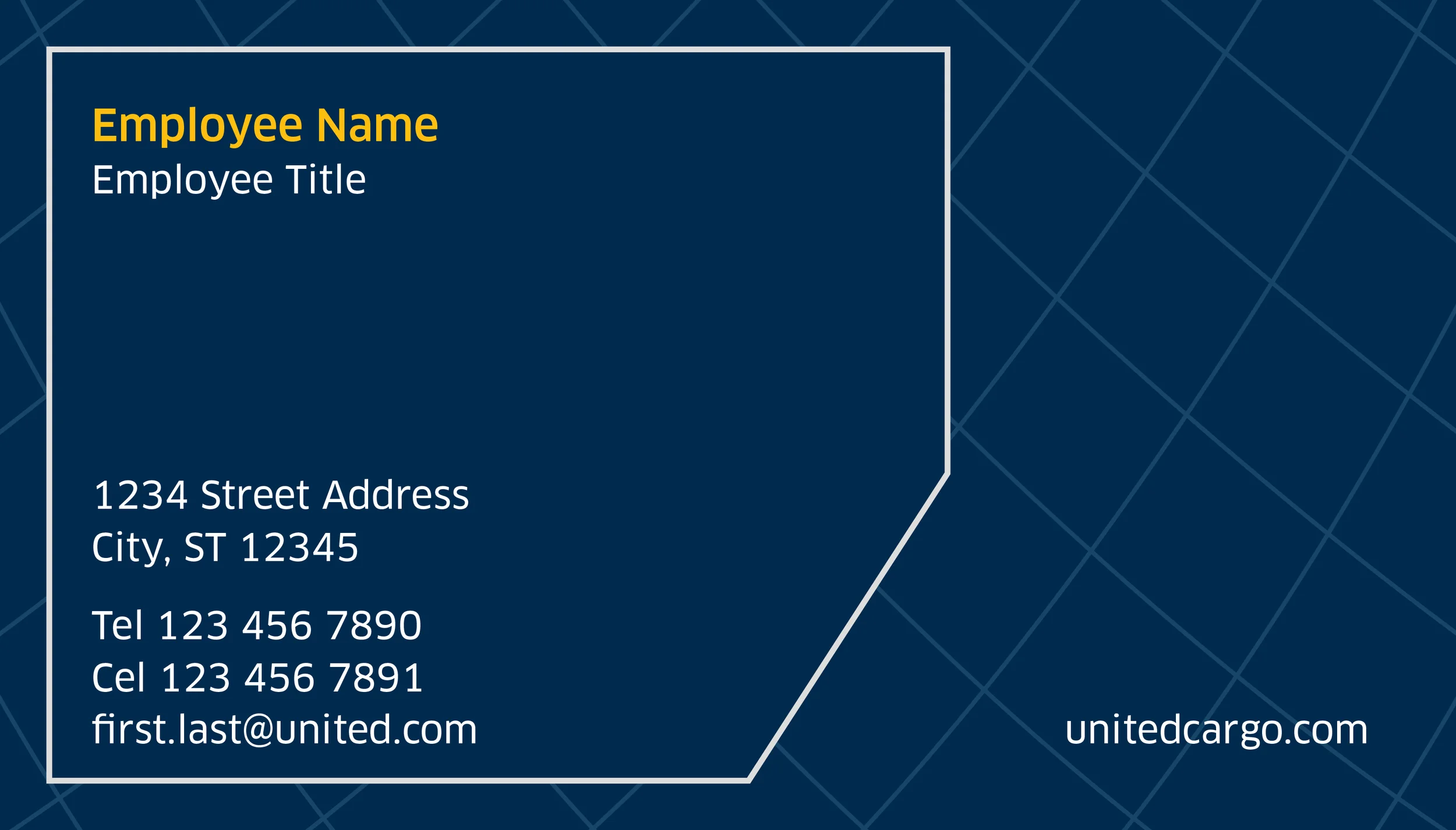
The color palette
The color palette was examined to incorporate a more professional lead color while leveraging United’s primary blue to tie to the master brand. In addition to the blues, "modern gold" was added for a pop of color, and develop a “sky” themed palette.
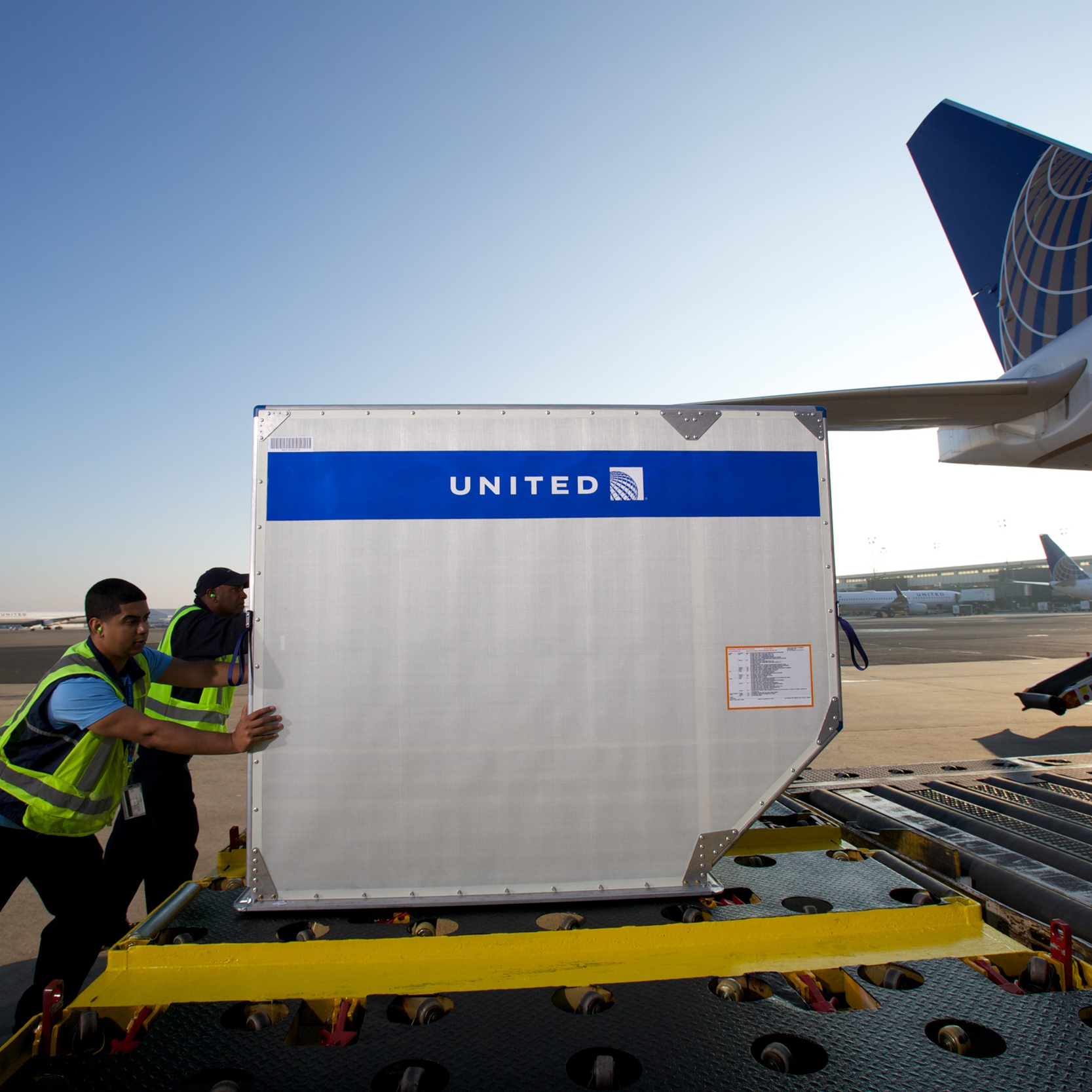
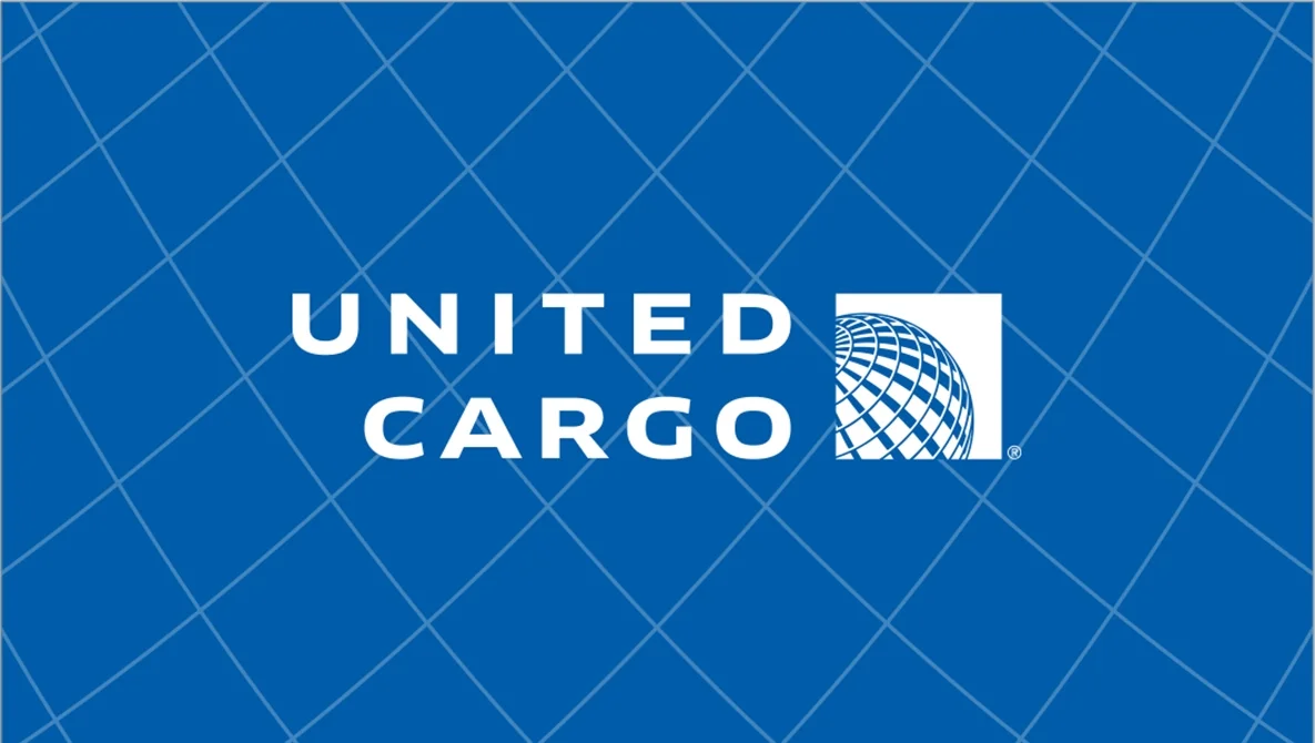
The Holding Shape
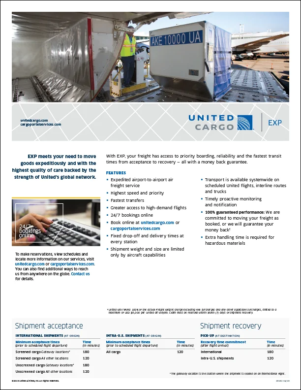
The holding shape was developed while examining the process of shipping cargo. Each aircraft accomodates different sized containers where products are stored. The LD3 container is the most popular container as it is versatile among the various aircraft types. To tie directly into the operations aspect of the shipping process a holding shape was developed and leveraged to become a primary component to the United Cargo brand.

the net pattern
Once the holding shape was developed it was decided that a pattern could also help tie the visual brand to the operations. Again, after examining the shipping process the “net” was identified. Nets are used to cover and secure multiple boxes on a shipping palette for a safe and secure trip. The added characteristics of secure, safe travel made the pattern a shoe-in for the brand. “Net Pattern” was developed with a more organic graphic lens so it would not be misconstrued as a checker board. There is movement and variation in the shapes to tie to the realistic appearence of the process.